
 Search
 List of Categories
 Who has read this topic?
 Add Reply
 Printable version
 Activate notification
General » Site updates
Reminder of the previous message


Published 10/06/2025 @ 20:16:51, By walter.

I'm using Firefox - they just used to be quite bigger than that
Published 10/06/2025 @ 21:33:28, By antp
It is strange, as on my Firefox they were about the same size. I think that before they were using the default font of the OS (so rather random from one PC to another), but now they use the same font as the rest of the page.
All texts have exactly the same size, plain text and fields.
I'll try to slightly increase the size of the box around the fields to make all a little nicer, but the text of the fields has no reason to be bigger than the rest. Or if you want a bigger text in overall, there is the new option 'Larger text' in the profile. Maybe I'll slightly increase the overall size of everything and put an option to define a custom zoom like for the admin pages.
I'll contact via private message you tomorrow so you can check on an old copy of the site (similar to the test site), if you can make a screen capture, so I can try to understand better what exactly you miss from the old version
Latest Edition: 10/06/2025 @ 21:34:24
Published 11/06/2025 @ 17:01:18, By antp
I applied some changes to the fonts and input/select/buttons, hoping it will be better for everyone (or most).
Again, it is normal that it is slightly different from before, but the idea is to improve some parts, not specially keep the 2005 style forever
You can now specify the zoom in %, in case you want smaller fonts or fine tuning like 95% or 105% rather than the 100/120 option that was hidden behind the checkbox.
If you have issues with fonts/styles, please include a screenshot. If you want to access the old version of the site to compare it in a screenshot, just contact me via private message, I'll provide you a link to an old copy of the site for that.
I dropped Arial from the CSS, it is too ugly. In case you didn't have Verdana installed, you were seeing the site in Arial. If you really liked that, you can still set it as default sans-serif font in your browser, it should then be used for the site.
Beside that, small new feature: limit to 300 post per day per person. I checked since more than one year, nobody was posting more than about 200-240 post per day (and these were already exceptional), with an exception around 270.
This will help avoiding a flooding of spam like what we had one evening some time ago.
If someone ever reaches the limit, just wait midnight CET
Latest Edition: 11/06/2025 @ 17:08:55
Published 11/06/2025 @ 17:41:08, By MisterZ
Hi antp, I still prefer the way it was before. Not a big fan of the changes to the fonts and font sizes. Of course things have to change, but was there anything wrong with the 2005 style in the first place?
Published 11/06/2025 @ 17:45:14, By antp
Some elements had no defined size (fonts and size depending on browser settings and operating system), so I just cleaned and fixed everything so it looks similar everywhere. This also allows to change the font size in the profile (for that, the font must be coherent and linked between all elements). Also improving some for mobile use.
What is the problem exactly? Is it just because something changed? If so, after a few days/months you'll get used to it.
Or if there is a particular point, maybe it can be tweaked.
Latest Edition: 11/06/2025 @ 17:48:53
What is the problem exactly? Is it just because something changed? If so, after a few days/months you'll get used to it.
Or if there is a particular point, maybe it can be tweaked.
Latest Edition: 11/06/2025 @ 17:48:53
Published 11/06/2025 @ 18:03:46, By MisterZ
The new font/size seems to be spaced out more, meaning less information fits per line. If I change it to 95% size in profile, it looks like it did before. So why not just leave it the way it was before and let people adjust the size in profile if they want it larger?
The vehicle thumbnails are only a fixed size, so the amount of text that can fit underneath them per line is quite important.
Latest Edition: 11/06/2025 @ 18:26:07
The vehicle thumbnails are only a fixed size, so the amount of text that can fit underneath them per line is quite important.
Latest Edition: 11/06/2025 @ 18:26:07
Published 11/06/2025 @ 18:33:28, By antp
If it is good for you with 95%, what is the problem? Just let it on 95% 
It also depends on your screen, browser, etc.
I can't make it too small as many people have problems reading small texts (I can, but for non-latin characters it becomes complicated).
Latest Edition: 11/06/2025 @ 18:34:14
It also depends on your screen, browser, etc.
I can't make it too small as many people have problems reading small texts (I can, but for non-latin characters it becomes complicated).
Latest Edition: 11/06/2025 @ 18:34:14

Published 11/06/2025 @ 20:03:20, By rjluna2
I did noticed the font changes today 
I may have to squint a bit (I'm about 60-year-old gentleman with glasses on)
I may have to squint a bit (I'm about 60-year-old gentleman with glasses on)
Published 12/06/2025 @ 06:36:50, By antp
So for you it is now smaller? Strange, for most of the people it had the opposite effect.
If you need larger text, you can easily change it in your profile
Others wanted it smaller
Latest Edition: 12/06/2025 @ 06:37:24
If you need larger text, you can easily change it in your profile
Others wanted it smaller
Latest Edition: 12/06/2025 @ 06:37:24

Published 15/06/2025 @ 08:17:58, By MisterZ
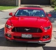
Antp, here's an example of why the larger text size is worse. See Cadillac - on the left (100% size) the text doesn't all fit onto 2 lines, spilling over onto a 3rd line. The right side is 95% (how it looked like before).

By the way, the site has been very slow the last few days.
Latest Edition: 15/06/2025 @ 09:40:41
By the way, the site has been very slow the last few days.
Latest Edition: 15/06/2025 @ 09:40:41
Published 15/06/2025 @ 11:24:42, By antp
If it works fine at 95% what is the problem for you?
This is a random edge case when 100% does not fit but 95% does, but in many cases both fit, and in other cases none of the two fit.
Maybe I should a little increase the thumbnail size too, at some point, it may be better than reduce the text size for many people (not everybody can read small texts like us
About the speed, there are some bots that are very active
When the site is slow, an admin can enable the bot filter. Yesterday it worked well when I did it, but there must be an admin active on the site for that.
This is a random edge case when 100% does not fit but 95% does, but in many cases both fit, and in other cases none of the two fit.
Maybe I should a little increase the thumbnail size too, at some point, it may be better than reduce the text size for many people
(not everybody can read small texts like us About the speed, there are some bots that are very active
When the site is slow, an admin can enable the bot filter. Yesterday it worked well when I did it, but there must be an admin active on the site for that.
Published 16/06/2025 @ 12:24:59, By MisterZ
If it works fine at 95% what is the problem for you?
No problem for me, but it would be nice if everyone could experience the site the same way I do. As for the site speed, right now (12.30pm Europe time) the site is so slow that it's practically unusable.
Latest Edition: 16/06/2025 @ 13:13:11
Published 16/06/2025 @ 14:21:57, By antp
Well, people with a different eyesight won't experience it the same way
Right now it seems to work well, maybe the server was more loaded two hours ago.
I don't really have time to check further right now
Right now it seems to work well, maybe the server was more loaded two hours ago.
I don't really have time to check further right now
Published 16/06/2025 @ 22:52:20, By night cub
I had to engage the bot filter once yesterday
Published 17/06/2025 @ 14:41:45, By MisterZ
Just a suggestion, regarding the "view more" feature to show the list of alternate titles - there's no way to collapse the list once you've expanded it.
Published 17/06/2025 @ 17:05:02, By antp
Indeed... but that's not very useful to collapse it, as it will be collapsed again next time you open the page.
If you wanted to see them you see them
If you wanted to see them you see them
Published 17/06/2025 @ 22:35:11, By night cub
One thing that I have noticed, is that when you are writing a comment, the font size is the small size and not the larger font set. Or is that part of the "Management pages" setting? Because I had that set to 100%?
Latest Edition: 17/06/2025 @ 22:37:45
Latest Edition: 17/06/2025 @ 22:37:45
Published 18/06/2025 @ 10:34:10, By antp
What do you mean by "the larger font set"?
It is the same font as other fields and the text of the page, and (should) becomes larger when you change the text size in your profile (not the management page setting).
When releasing the new version last week I briefly increased its size, but afterwards I changed it back (when tweaking a little the field sizes, to address complains), thinking there was no reason why specifically that one would be bigger.
In the old version of the site, it was depending on the OS/browser, like other fields, so for some it was bigger and for others it was a similar size.
Latest Edition: 18/06/2025 @ 10:36:48

Published 25/06/2025 @ 18:42:59, By andyhao
The layout of the flag icons and words seems a little bit off, I don't remember they look like this yesterday.
https://www.imcdb.org/vehicle_847719-Alfa-Romeo-Sprint-902A-1983.html
Just for reference, it may not be a good comparison since I can't found a recent archived car page, but the layout was normal even after the big update recently.
https://web.archive.org/web/20230707045101/https://www.imcdb.org/vehicle_847719-Alfa-Romeo-Sprint-902A-1983.html
Add Reply